
It’s not often an Internet search yields only a few or (gasp!) no results. The typeface Farringdon is one of those rare examples. I came across the character set in an old Photoset book and used it manually as needed for the past decade. So, when it came time to create a giveaway for this site I decided to dust off Farringdon and give it a facelift. But all I had to go off of was the name. Where was Farringdon? Where had this typeface come from?

Typeface Hide-and-Seek
A quick search of Farringdon typeface returns ~83,000 results. After hours of chasing ghosts, I found almost all the results pull from an entry provided by Dan X. Solo of SoloType that has been copy-pasted across type vendor sites:
An old wood type we picked up in London from the Fredrick Ullmer Company. It’s not marked, and we’ve never seen it in a catalog, so we don’t know who made it.
Searching “Fredrick Ullmer Company” tells me that it was a London-based Type Foundry, so we’re (digitally) off to London, England. A quick geography check shows that Farringdon is a district of London. Great! It’s a typeface from Farringdon, London so it’s called Farringdon. Done! Right?

But Farringdon is already a Typeface…
I love the work of Dan X. Solo and his crew. They have single-handedly exposed thousands of old display typefaces to thousands of designers. Digitizing these typefaces (even roughly) allows them to continue to live on through use. This is core philosophy behind reviving Farringdon: Perservation through use.
If you know you’re type-preservation philosophies (who doesn’t right?), you might recognize this from Hatch Show Print. This printshop has been running continuously since 1879, and still uses and restores the original print blocks for contemporary jobs today.
Armed with the inspiration of Dan X. Solo and philosphy of Hatch Show Print, I set out to redrawing Farringdon from my own specimen. But how was I going to make this typeface different from the one already produced by SoloType?
“Yes, And…” and a New Philosophy
If you’re a regular reader, you know that I do improv comedy in my spare time. The primary philosophy of improv is to “Yes and…” anything your partner gives you in a scene. It moves the action and relationship forward between the players by accepting and adding to what has been created. But how does this apply to type?
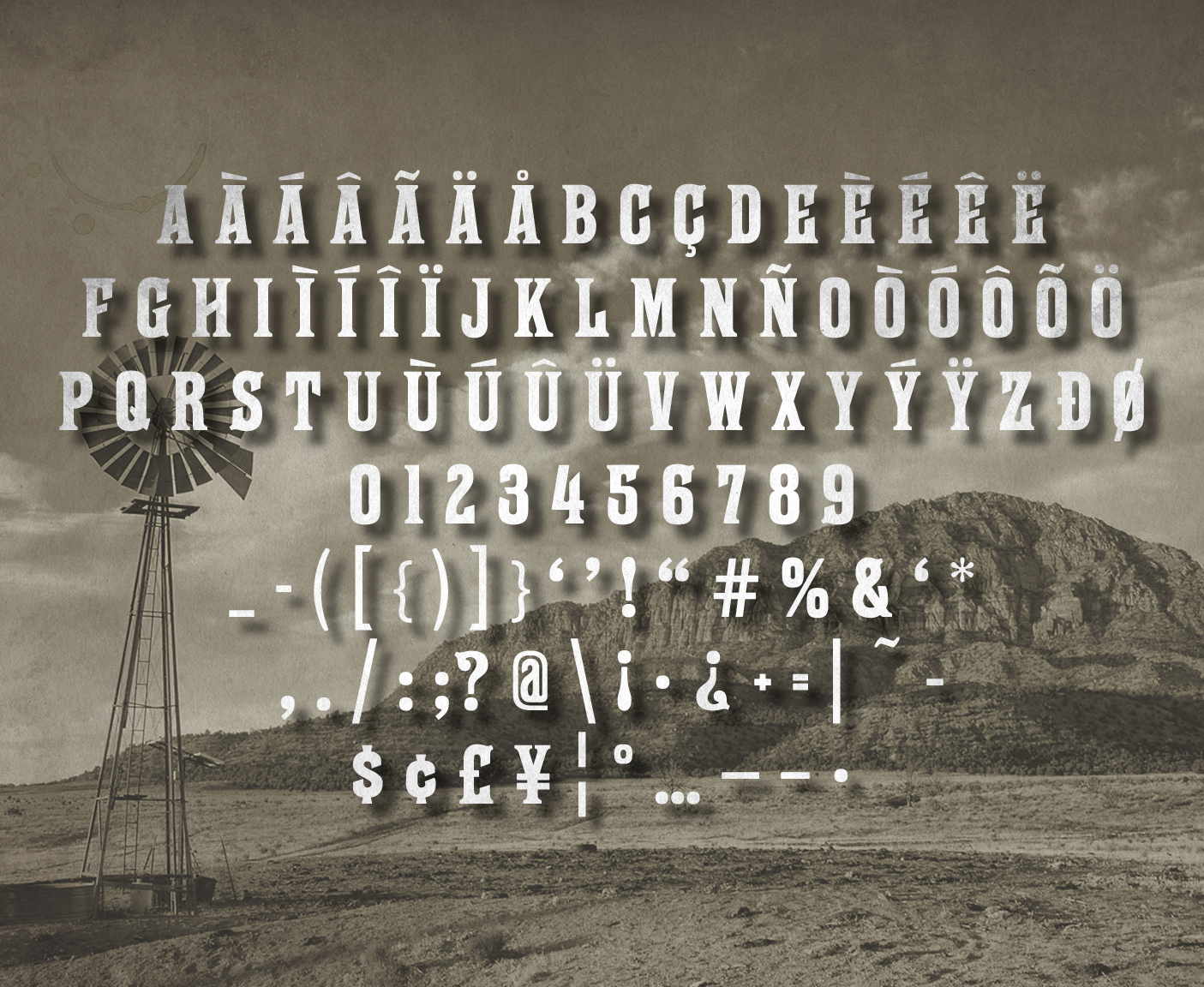
Looking at SoloType’s Farringdon, they fully admit to adding a lowercase. Frankly, I didn’t like the lowercase and I may visit my own lowercase one day. I also left it out of my version because that was their contribution to the typeface, and not found within the public domain. I’m no thief.
I set out to preserve and tune-up what was original, but also add a few modern typographic amenities to make it more useful in a headline setting. Out of this came my new philosophy for revivals: Preservation through functionality.
This means not only digitizing a specimen, but adding language support, improving the spacing, adding OpenType features, adding modern characters, or anything else that makes the typeface work better for modern designers.
Even with these ‘simple’ freebies, I want designers to feel like they got something useful and of value. That’s what I want when I get a freebie. It might sound like being a choosy begger, but it’s true. Free does not have to equal low quality.