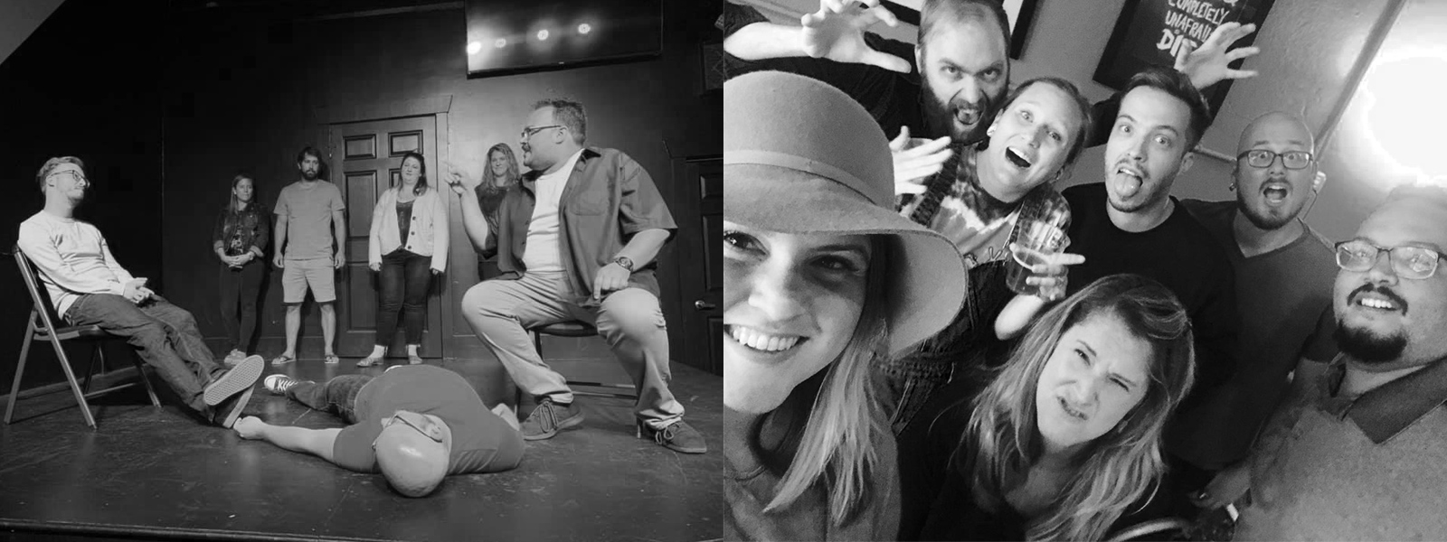
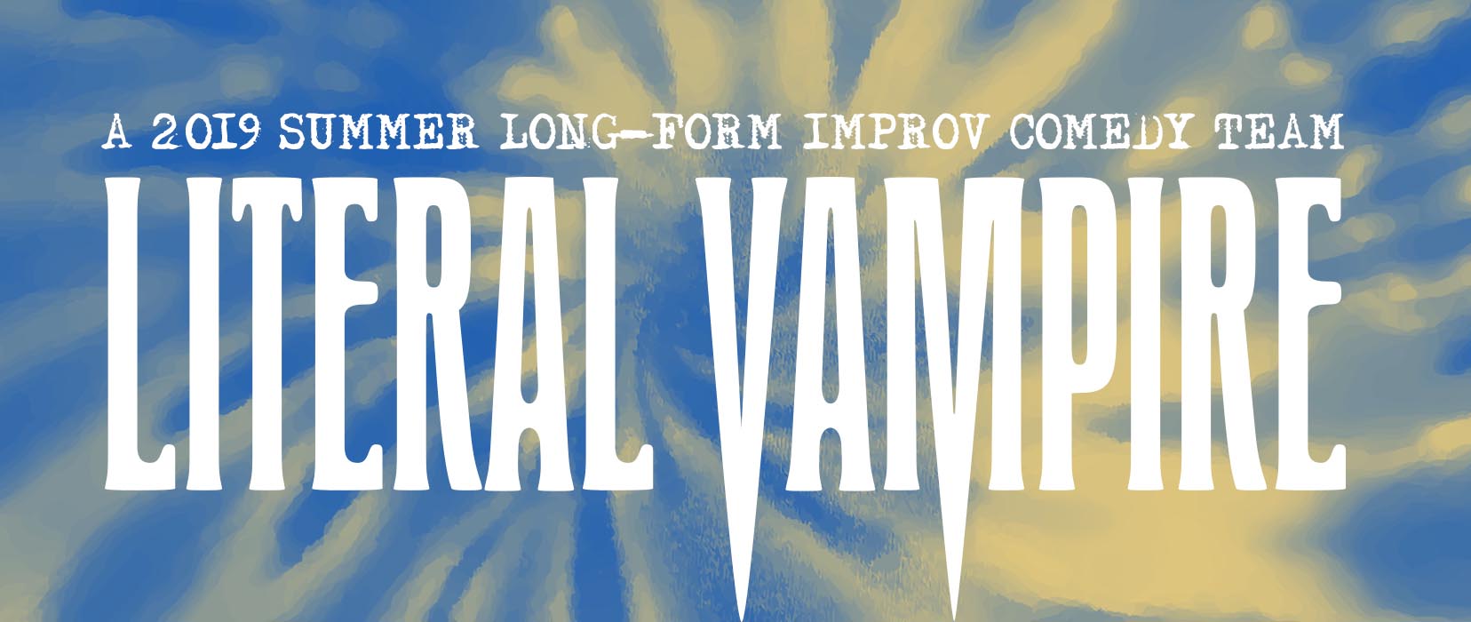
This past summer, I was fortunate to be a part of an improv comedy house team at The Push Comedy Theater in Norfolk, VA. Like improv comedy, these teams are temporary with a season only lasting 3-4 months. Being the co-captain this time around, I took it upon myself to handle the branding and identity for my team: Literal Vampire.
“A Vampire in Broad Daylight”
Where the hell did the name Literal Vampire come from anyway? Like anything in improv, it was created in a spontaneous moment. During our first rehersal as a team, a teammate blurted the phrase out mid-scene. I won’t bore you with the setup, but the line was, “No. I’m a literal vampire.”
But what is a Literal Vampire exactly? As a group we didn’t know, but we knew it was funny. In an effort to promote our first show, I took it upon myself to figure out what we looked like for the next few months. After a quick brainstorm session, I decided to celebrate summer vibes and the historical look of vampires in pop culture. The phrase “a vampire in broad daylight” came to the forefront and became the guiding line for the final brand.
Historical References
I’m a fact-finder by nature, and when starting any branding project there’s a lot of research. Many times, there’s a firm foundation to build on buried in the past. All you have to do is dig a little and fall down a rabbit hole or two.
Sure the original vampire in pop culture was Dracula, but the arguably the most notorious was Nosferatu (created as an attempt to circumvent IP laws). Starting there, I looked to the original theatrical poster (1922) and found inspiration for the typeface. While the poster used a typeface called Herold Normal, I took “one step to the left” and used it’s sibling: Herold Condensed. A few thoughtful adjustments later and Literal Vampire had it’s signature fangs.
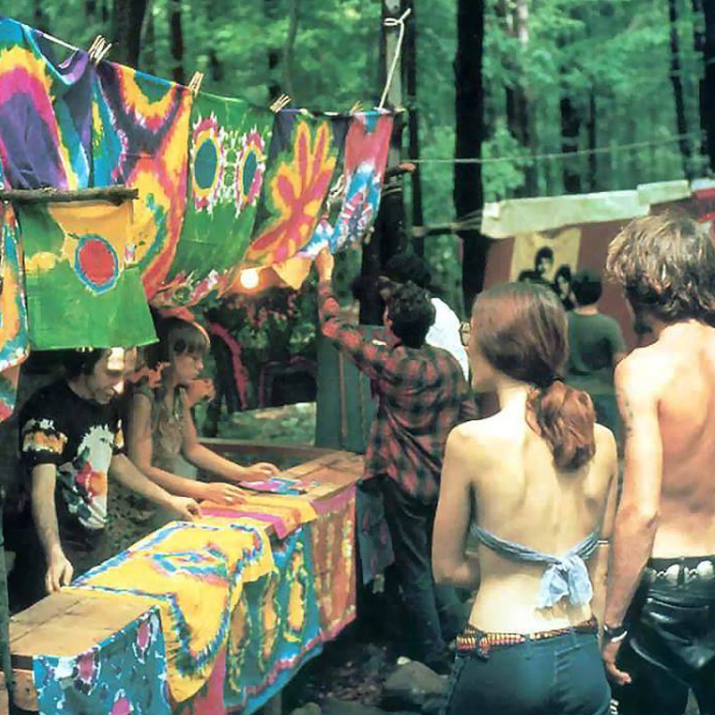
But what about the feeling of summer and fun? Instead of inventing a version of “summer goth”, why not ‘zag’ and celebrate color instead? Long story short, I circled back to the typeface for inspiration. Herold Condensed was a product of the first wave of Art Nouveau, which experienced a revival in the 1960’s. Which lead me to 1969 and the most iconic summer of all: “The Summer of Love.” Looking at Woodstock for color inspiration, there it was as plain as day: tie-dye.
The odd combination of vampires and tie-dye was the perfect foundation for a brand built on the principles of improv comedy and the fun nature of performing with friends.
Better Branding Builds a Better Team
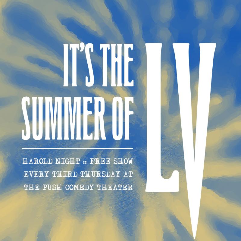
In addition to regular practices, Literal Vampire had a regular promotional schedule. We used social media to get the word out without spending a dime and only taking a minute to post. Updating cover photos and instagram stories of the performers bolstered attention and gave the team a visual unity. Although any improv comedy set can be hit or miss, Literal Vampire was described as “fucking ambitious.” We were certainly not immune to failure, but the collective risks we took and our unwavering support for one another was proof of our group mind and energy.
I’m a firm believer that having clear branding and good-looking tools to promote shows helped bond Literal Vampire and make us a stronger team. Good branding and easy to use tools (in this case graphics) became our flag we all proudly flew for the summer. While this was done for a temporary comedy team, branding for any startup or existing company is just as important (if not even moreso). Branding is not only the image a company projects to an audience, but it’s a shared mindset of the culture within.
If your team isn’t playing well together, you may want to look at the signals your brand is sending out (and saying within). While it won’t fix all your issues, well-defined and meaningful branding can bond a team and attract your audience. If you’d like to talk about how your brand can better serve you and your audience, get in touch with me.


