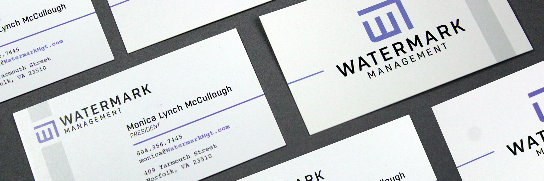
Watermark Management often develops their properties by saving and preserving historical buildings. They tow a thin line of creating a luxury space, while altering the building as little as possible and preserving it’s original character. Being mindful of resources and having a light touch were key concepts that needed to be communicated in their new identity.

Visual Landscape Analysis
It was tough to find a color Watermark Management could own in a saturated landscape of Real Estate. After researching all national and local competitors, a fresh, understated, and authoritative color was found in the gaps.
The typographic landscape was a preverbal grab-bag with seemingly no trends. The final mark pulls from the drafting table where all ideas begin with architecture, and uses a minimal amount of form to create the logo.

All of the design in half of a mark.
Monica Lynch-McCullough at Watermark Management immediately knew that the architectural mark was the right decision. Combined with the medium-purple color, Watermark knew it had a chance to own a respectable color within the property management market.


Defining the negative space.
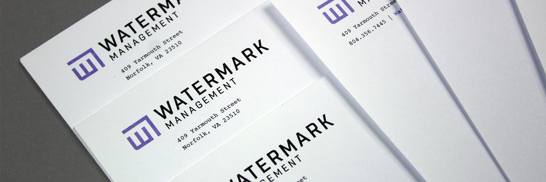
In an architecture blueprint, boundaries (walls) define living spaces. The same design logic was applied to the identity. The limits of one space craft another area from the negative space. The same concept of “looking twice” applied to the company’s namesake, the water mark. Often used on stationery, a water mark is an invisible mark of quality meant to be present but not seen.


An online headquarters.
The website for Watermark Management was poised to be the online pivot point for all the properties that would eventually be developed and managed. As the site was set to go live, finances ran dry and development stalled at 99% and never moved again.


