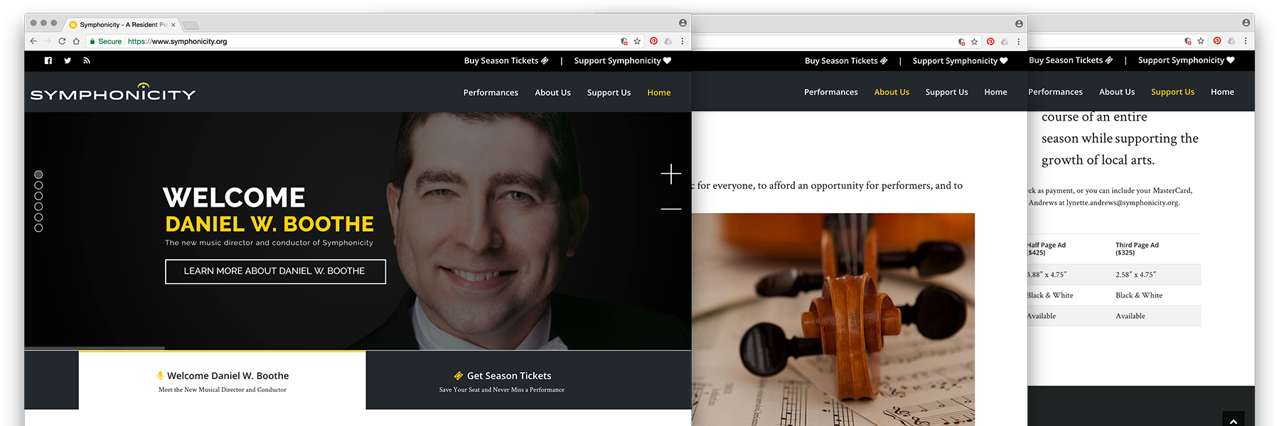
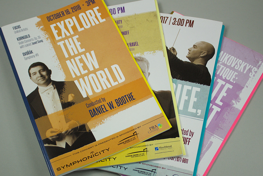
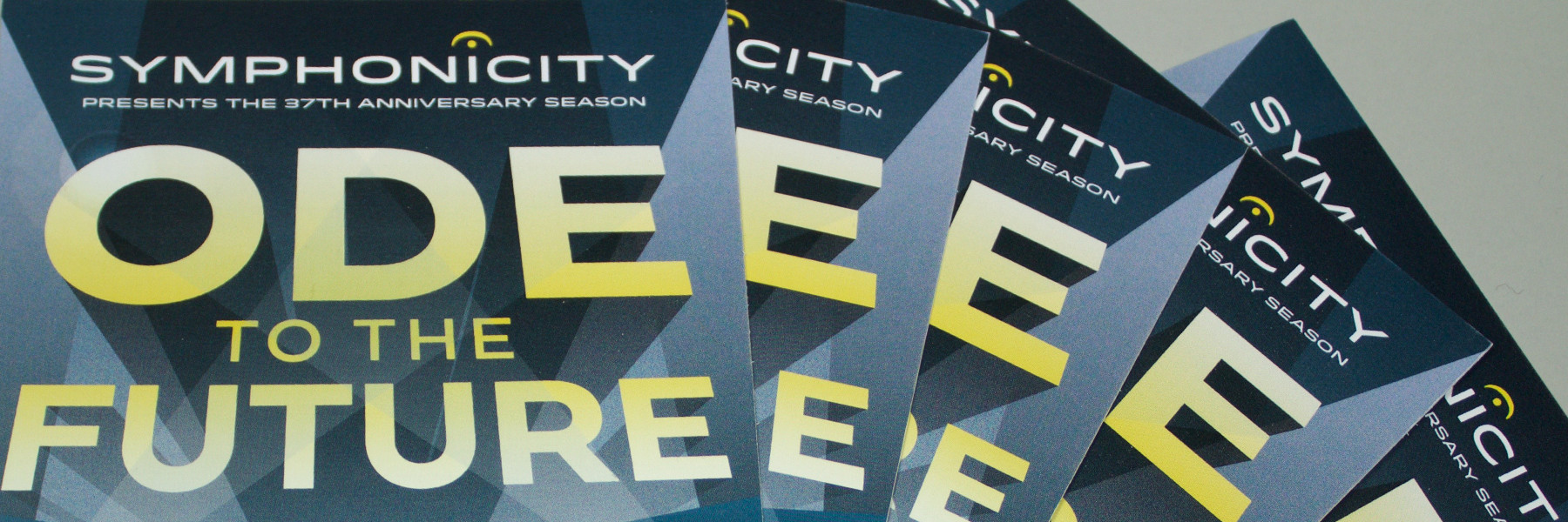
When Symphonicity celebrated 35 years of performances, and decided to blow the dust off their brand. The symphony keeps the work of the old masters alive through regular performances, but also exposes their audience to modern, neoclassical pieces as well. When the original maestro retired, they began a search for a new leader and wanted their brand to reflect the same new beginning.

Tuning up.
For 35 years the Futura-set logo worked, but it didn’t reflect the level of talent of the symphony behind the logo. The old mark was dated and the letter-spacing was hap-hazard. The existing gold color looked like it gained 35 years of wear too.
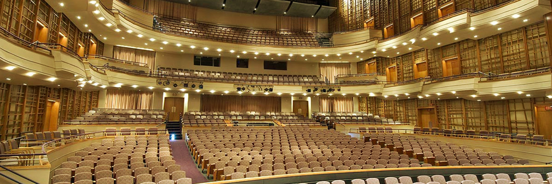
Symphonicity had become a refined group of musicians and resident company of The Sandler Center in Virginia Beach and it was time for some adjustments.
All parts playing in harmony.
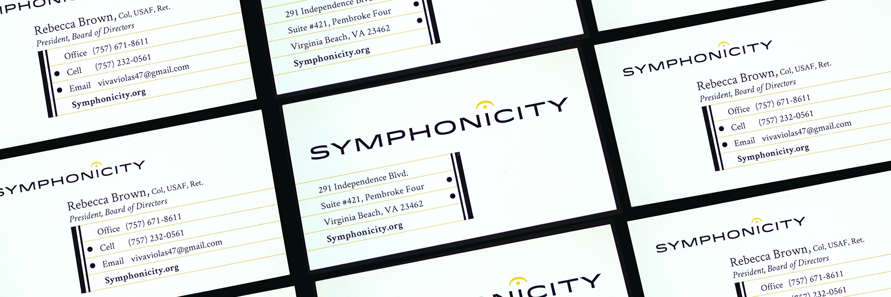
Symphonicity easily transitioned to using their new mark while preserving their brand equity. All the familiar elements were there, but everything looked lively and new. The new, energetic gold replaced the previous ‘antiqued’ version. The open-spaced Futura look-alike was replaced by extended, better weighted Idlewild with better rhythm. To top it off, a custom fermata was drawn to match the curves of extended letters.

Fermata becomes punctuation.
In musical notation, a fermata is a mark over a note designated to be lengthened by an unspecified amount. Many times it appears at the end of a musical thought, used to help emphasize the end of the piece or movement. It essentially was the punctuation on the music.
The approach to drawing a fermata from scratch was no different than drawing a new piece of punctuation. The dot has similar shape and proportion to the period and title (dot) of a lowercase ‘i’. But drawing the arch is where real finesse was used:
featuring tapered strokes, rounded endings and the same extended path of the ‘O’.
With that much care going into the fermata, it became a beautiful mark on it’s own. It would become an integral part of the brand acting as a signature and taking on a personality to reflect the appropriate sentiment.

The Quest for the Best.
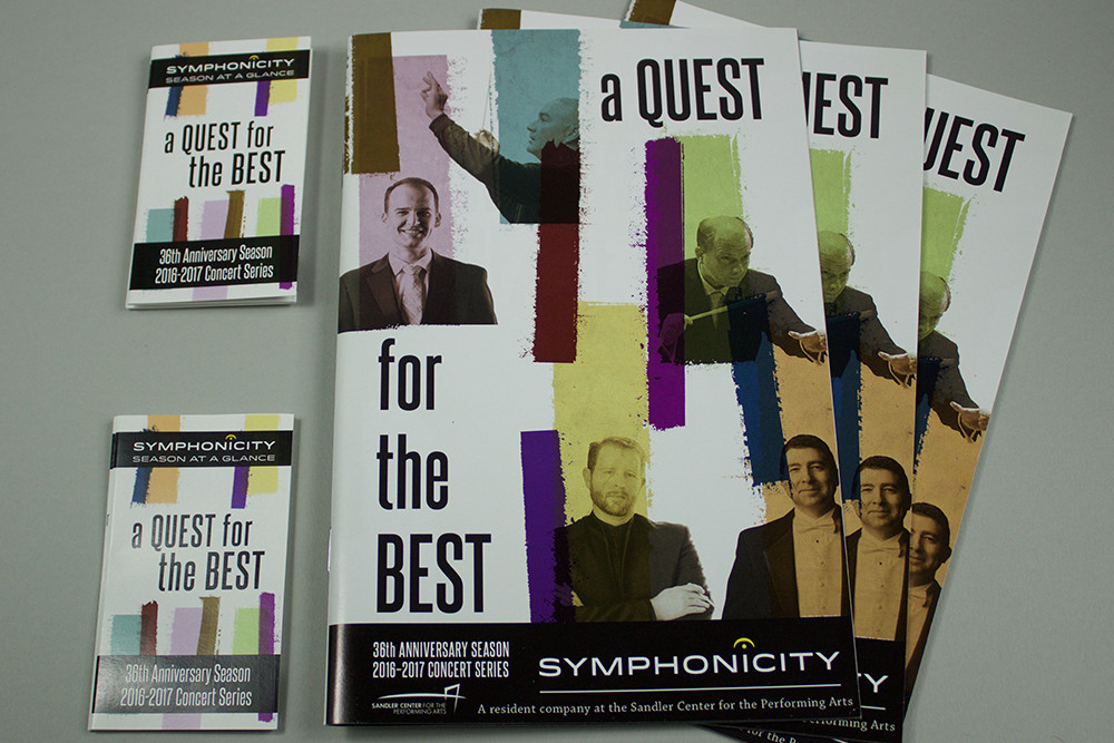
For the 2016-2017 season, Symphonicity invited 5 world-renowned conductors to put on the show of a lifetime to become the new maestro of Symphonicity. This featured video was used to announce this momentous season and debut Symphonicity’s updated identity.
Played before live events and shared online, the video signified a new digital beginning for Symphonicity. Before this video, their social media channels had never been utilized to coordinate an announcement of this magnitude.
From the garage to the concert hall.
Symphonicity’s website hadn’t aged well. It still had the scrappy, DIY looks of a garage band finding their legs. While Symphonicity began in a garage, it was time for a site that positioned the inline their competitors. The new website quickly grew to include an e-commerce element for ticket sales, concert and event management, and even a members-only section for musician resources.
