Type design can start from a lot of places. But one of my favorite places is from old “functional lettering”. I use the term “functional lettering” because it’s flourished lettering like we think of today. And it’s not precision type created from a printing press. It lives somewhere in the middle. A message needed to be communicated, so someone wrote it, painted it, or drew it. Old hand-painted signage is a perfect example of this.

Typeface DNA & Decisions
The reason I love these sources is in addition to the clear letterform anatomy, they often have strong (naïve, in some cases) decisions. These decisions carry through the text and add unique character to the existing typographic frame.
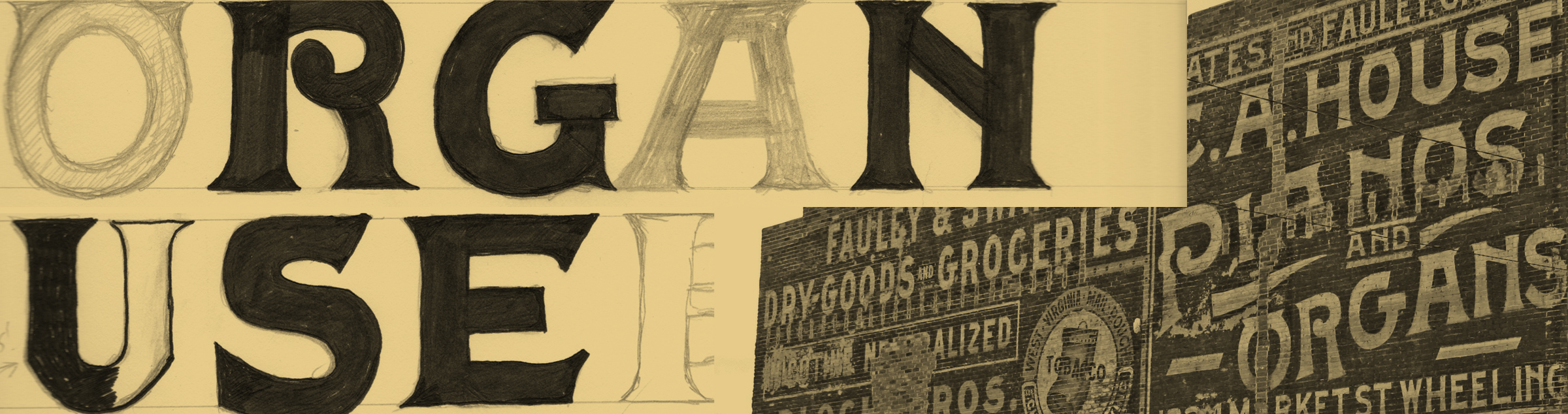
Grafton Black is based off an old building advertisement in Graft, West Virginia. The original was created by hand, and is loaded with quirks and character. Flourishes, extra serifs, and ball terminals are all present in the original.


Old Dog, New Typeface Tricks
The process that ensures here is like any good rebuild or renovation: you strip it all the way down to the bones. Fixing any issues in the skeleton and systemically rebuilding ensures everything is uniform, but also not too quirky.
The result is something obviously vintage-inspired, but completely new. Sometimes adjusting the proportions even the slightest bit can knock a typeface a few decades forward or back in time. Whether you mean to do it on purpose or not is a different story.

Typeface Design = Better Designer
Knowing how to design type has great advantages as a designer, and rebuilding from an old source can be an amazing exercise in decision-making. Not only is it training and refining your eyes for detail, but it’s also breathing new life into something otherwise forgotten. And just because it’s old and not “on trend anymore” doesn’t mean it’s useless. Good typography never goes out of style.