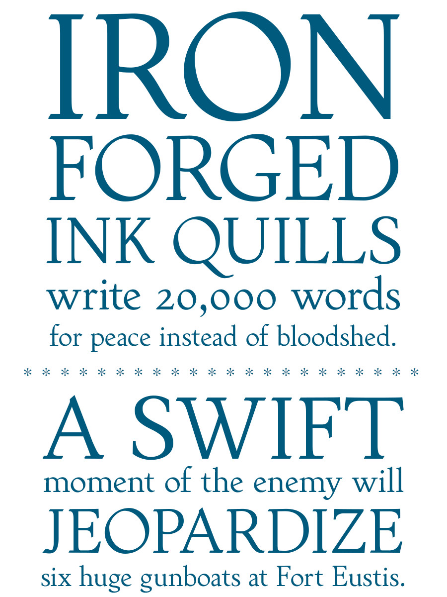
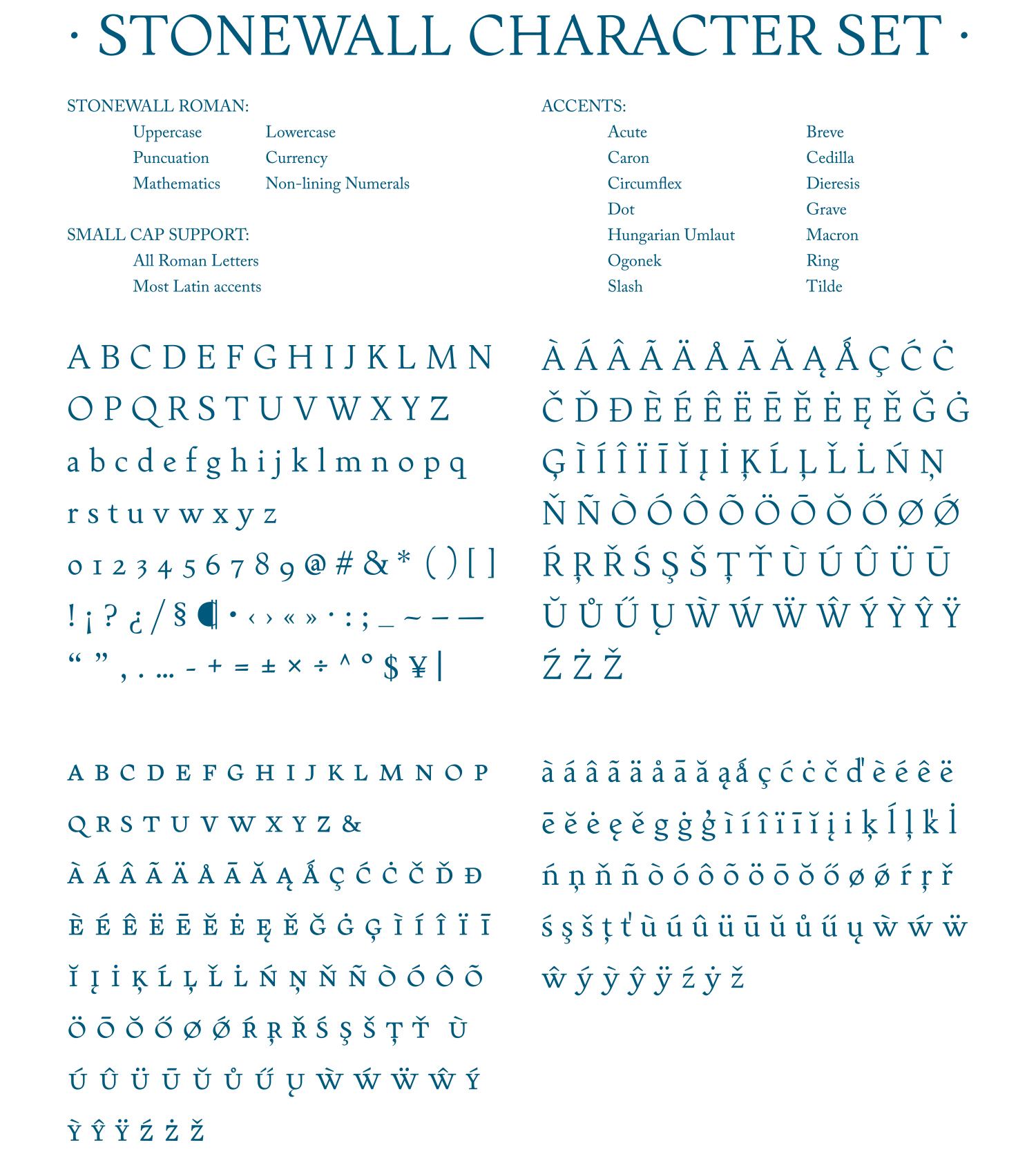
Stonewall is a text face suitable for extended text and titling within a print environment. With over 450 glyphs to a single Roman, it’s overflowing with diacritics suitable for any language the Latin alphabet can throw at it.
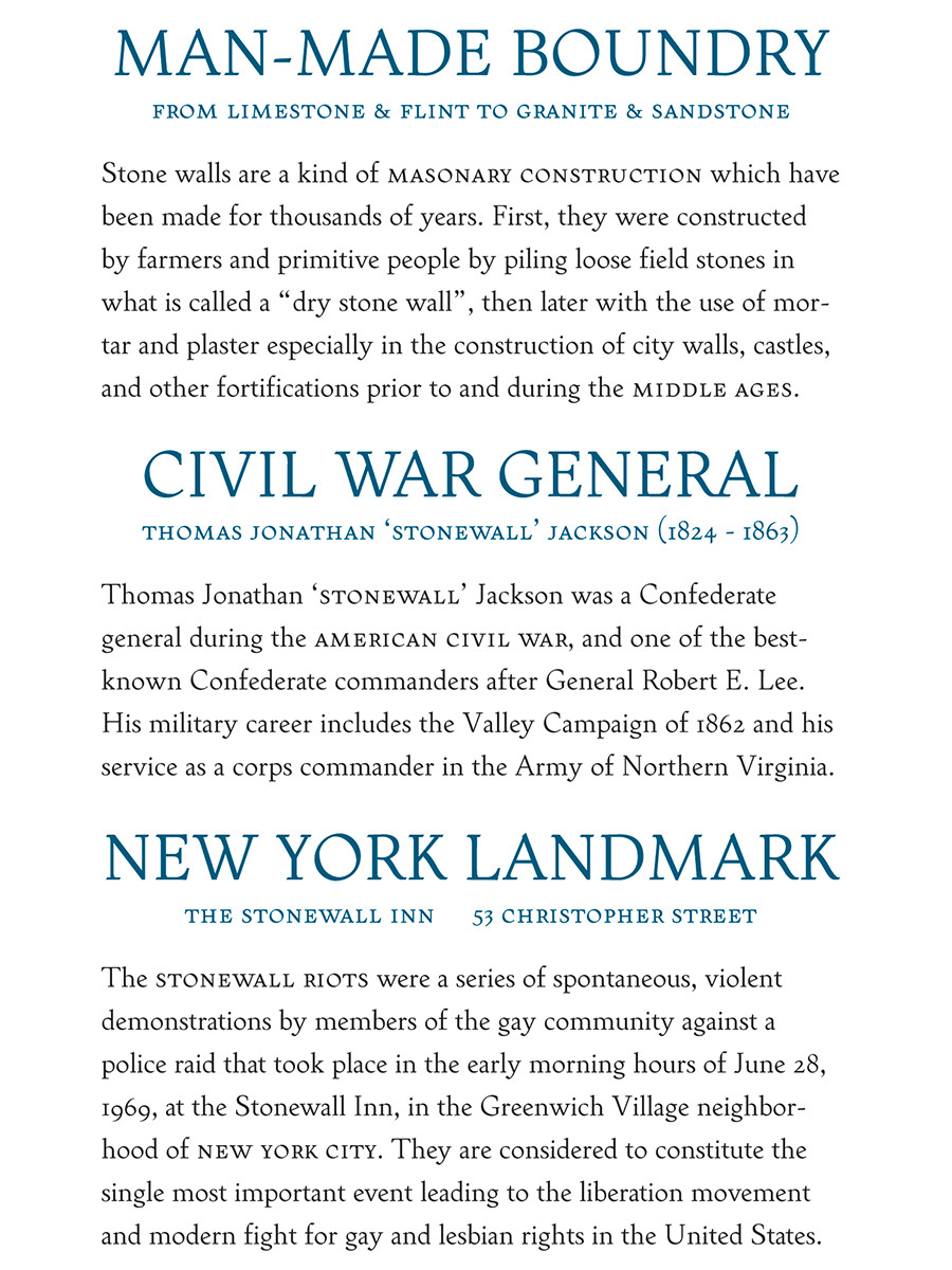
Stonewall holds up well at small sizes, bringing a lightness to large blocks of text. The small caps fall well in line with the lowercase and the non-lining numerals, creating a pleasant reading experience. But Stonewall isn’t restricted to small sizes. The details of each character shines when presented at larger header and titling sizes, giving a Trajan-like appearance to headings.

1. Wrought iron weapon details.
2. An axis of about 35°.
3. Long, smooth curves.
4. Carved, weathered entry serifs.
5. Signature asymmetrical serifs.
Rooted in Tradition.
Stonewall straddles the line between antiquated, dusty handwriting and type that is a timeless authority.
Developed from hours of calligraphic studies and experiments, a transition to drawing offered more freedom to express a certain personality within the typeface. Taking inspiration from castle walls and an overall medieval aesthetic, a lengthy battle to find a natural, yet expressive, serif treatment began.
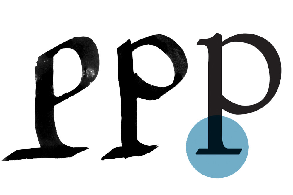
Making broad strokes with an ink and brush by following the standard roman calligraphic construction, I could augment the asymmetrical serif of a descender (or stem on the baseline). With the simple addition of a left-to-right horizontal stroke, a bracket was created on one side and the other was left with a 90° angle. While there are other typefaces that recreate this effect, they do not mimic the forward motion found in Roman calligraphy. Enter Stonewall.


