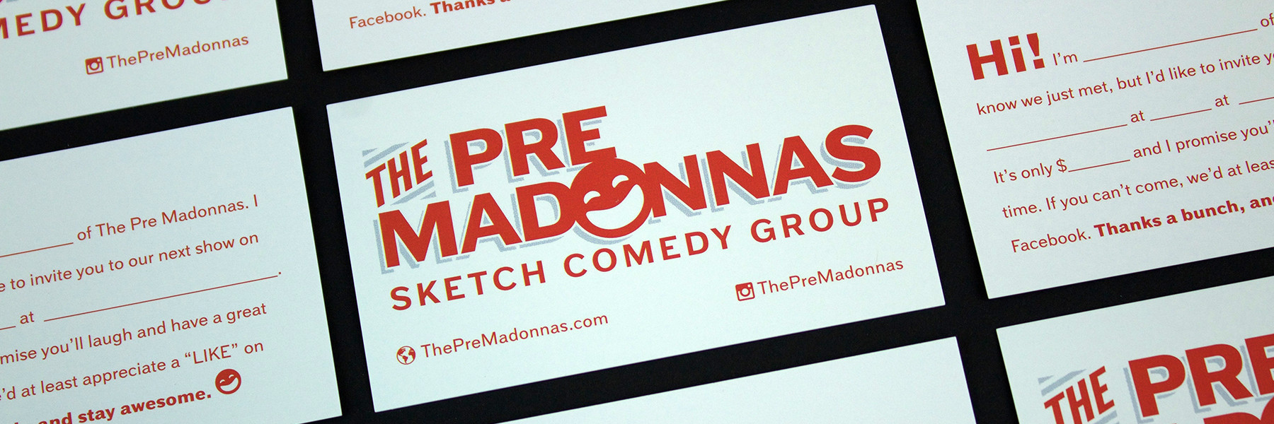
The Pre Madonnas formed at The Push Comedy Theater in 2015 in a Sketch Comedy 201 class. They soon realized their similar humors for fun, daily observations, and pop culture could be cobbled together and put on stage. With traveling shows in new cities on the horizon, they knew a professional brand was needed to contain all the funny.

Remembering to have fun.
Leaving a brand open for growth is tough, particularly when it comes to a brand needing to stay fresh and relevant. Instead of trying to give the group a singular personality to rally under, The Pre Madonnas needed a mark to remind them of what is important in comedy. It boiled down to the laughter. If the group was having fun and laughing, then chances were the audience would be too.

An Homage to Comedy.
The Pre Madonnas Sketch Comedy brand is a preverbal wellspring of comedic references. The most obvious being laughing mask of comedy that first surfaced in ancient Greece. But even the red color and sans serif typography have more contemporary comedic references. The brand is professional, historical, and resists pigeon-holing the group into a particular tone of comedy.


The Color of Comedy is Red.
Aside from the performance and usual visual gags, comedy does have it’s own patterns of visual material. The most subliminal being the color red. Modern sketch comedy was born from vaudeville and we find bright red in their painted banners and advertisements. We find red again in the title card motif of Looney Tunes and Merrie Melodies. Fast-forwarding to modern comedies, we find the color red being overwhelmingly used in movie poster typography. All of these historical and pop-culture references blended together to create the identity of The Pre Madonnas.


Weird Show Artwork.
The Pre Madonnas name their shows exclusively using ‘eggcorns’. And eggcorn is “a word or phrase that sounds like and is mistakenly used in a seemingly logical or plausible way for another word or phrase.” (Thanks Merriam-Webster). With these strange phrases, the literal visual interpretations are equally funny, weird, and entertaining in their own right. They are not a far cry from the old freak show banners used by traveling circuses. I have had the honor of creating the artwork for a few shows and have tried to honor the tradition.


Derek is one of the most talented, thoughtful designers I have ever known. I first learned of his abilities through the grapevine, but was privy to more of his process and insight as he built the branding for my sketch comedy group. Over the past few years, I’ve had the opportunity to work with Derek on and off stage, and I’m consistently impressed with his dedication, attention to detail, creativity, and insight, especially when it comes to branding and how to “tell a story.” His design work is incredible, and he’s fun to work with, to boot. Derek adds value to every team he’s on, and I highly recommend working with him.
Amber Nettles
Co-Founder of The Pre Madonnas

