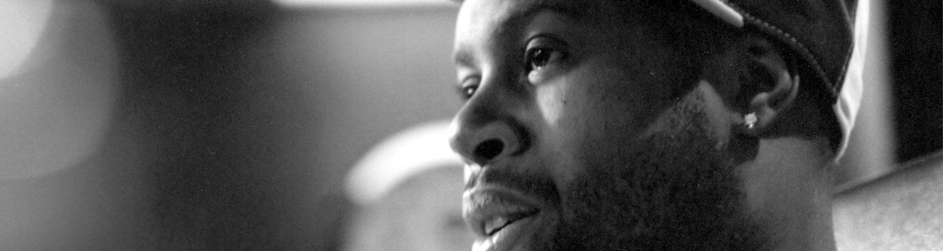
J Dilla is one of the most acclaimed beat-makers of all time. He did this over a relatively short career through the mid-90’s out of Detroit and his iconic tracks accompanied the most notable acts in the music industry down right down to obscure artists.
Without going into great detail, his notoriety came from how human his sampled tracks sounded. They lagged behind the beat, often times in odd patterns, while always finding their way back to the downbeat to eventually repeat the phrase. Roots drummer, Questlove, described Dilla’s drum patterns as that of a drunken toddler and praised him for the incredible natural flows these patterns created. Because of this, J Dilla is now remembered as the man that put the soul back in the machine.

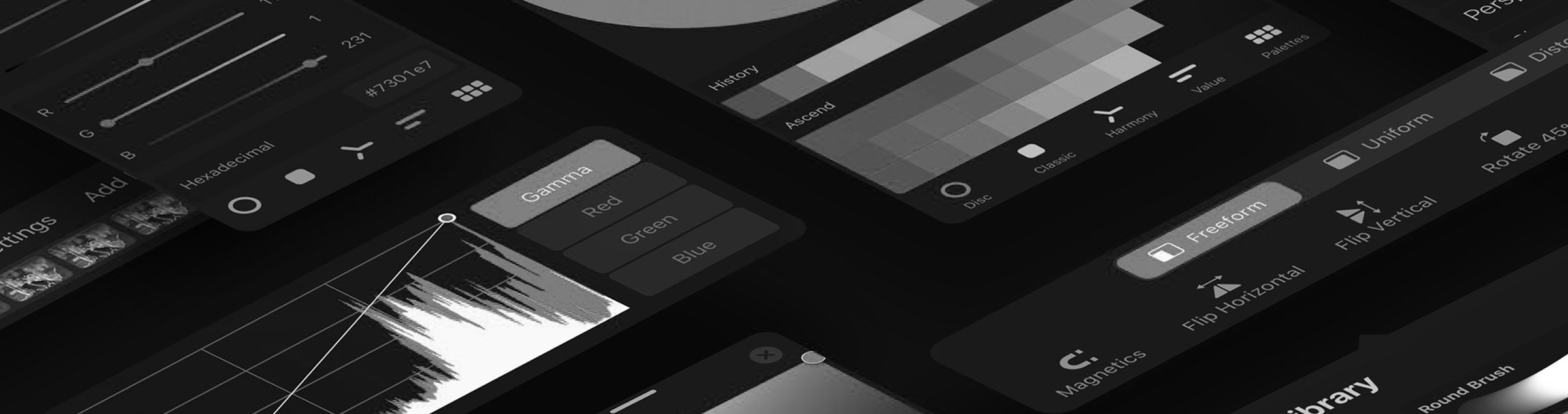
The technology surrounding lettering and type design over the past decade has exploded with advancement and accessibility. We’ve gone from settling for buggy Fontographer to having a real competition around software with Robofont, Glyphs, and a few other flashy Illustrator plug-ins. The iPad and Procreate have revolutionized the process seemingly overnight and captured gestural pencil marks in a digital medium.
In my own interest in these new tools, I gathered opinions from trusted friends and colleagues. I watched videos of people using the new tools in an effort to see how different is was from the act of drawing with pencil and paper. I saw videos where curves were ‘corrected’ as they were produced. I saw straight lines become perfectly straight lines. Stippled and lined shading were mathematically perfected. I realize that there is probably and on-off switch for such a feature, but it’s never sat right with me.
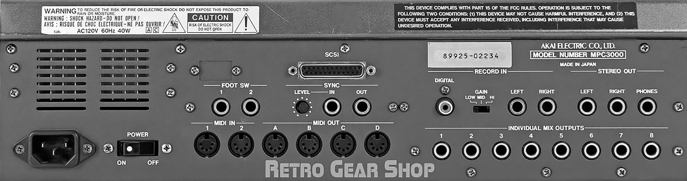
What made J Dilla’s beats so warm and human was his lack of use of the ‘quantize’ feature on his MPC3000. In a nutshell, quantization was common practice in sampling culture because it snapped the sampled sounds to the beats (or eight-notes, sixteenths…etc.) It made the inhuman sampling and drumming rhythmically perfect. It’s hard to know wether the lack of quantization was an initial over-sight in learning the machine or a conscious choice. Regardless Dilla recognized the character of the lack of assisted optimization. And the world of hiphop felt it.
All pursuers of type have used grid paper at some point. Whether they still do, or they used it in the beginning phase of their career to better train their eye. But creating type is an imperfect art. I was once told by Hannas Famira at CooperType that (and I’m paraphrasing) “…even straight lines aren’t straight”.
This is not a call to end or belittle any software that assists in drawing. Illustrator has been making perfect shapes easy for years. Nor is to glorify the analog methods. There is room for both to live and thrive.
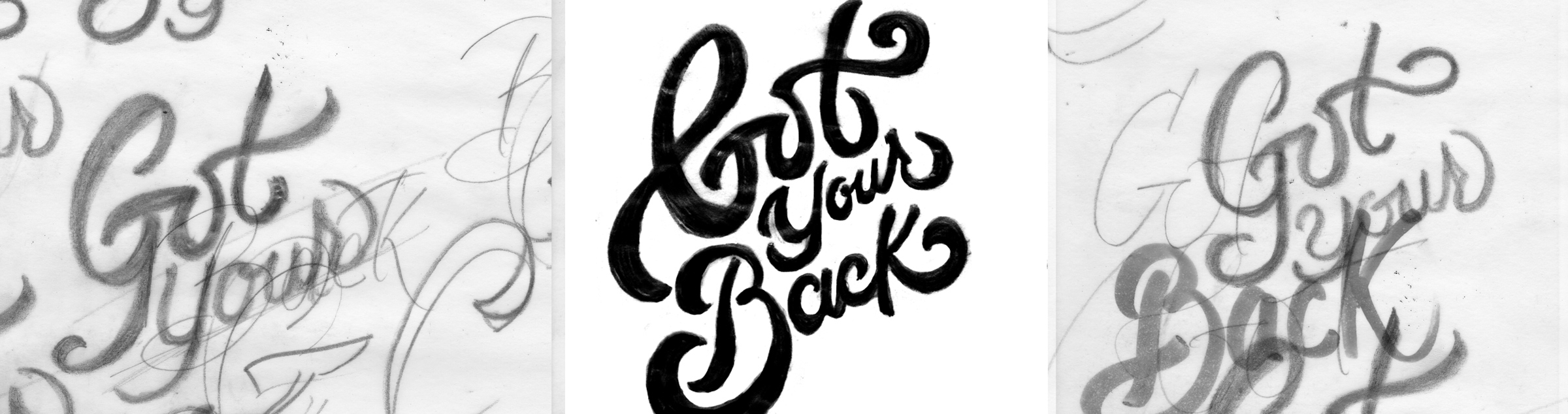
While working for a client, I attempted to vector some script I had drawn by hand. I got halfway through when I realized while my curves were true, something didn’t feel right. I needed to get a proof to the client, so I cleaned up my sketch for a few minutes, dropped it in my mockup and sent it off.
The more time I spent with the sketch, the more I realized that all the imperfections were great. The letters were warm, they were ‘human’. They weren’t perfect, but they were just right. Spoiler alert! The client thought so too.
I often struggle with handlettering being called hand lettering when it comes from a digital source. Sure your hand moved a cursor or an iPencil around a drawing field. But anytime digital optimization is used, it should just simply be called lettering. The hand is what gives it character. And that character gives it life. Even the most skilled drawing hands in lettering are not perfect.
I don’t know if I’ll ever draw using an iPad. And even if I do, I don’t know if I’ll take advantage of the assistive features. I like that my hand isn’t perfect. I like that my lettering follows a tradition and framework, but knows that sometimes you have to account for the unaccountable. I like that my hand isn’t perfect.
This essay is part of on-going series “Hip Hop & Type”, a series where aspects of hip hop offer a lens of observation into the world of typography. To view the audio version of this essay, head over to IGTV and check out the “Hip Hop & Type” series.
