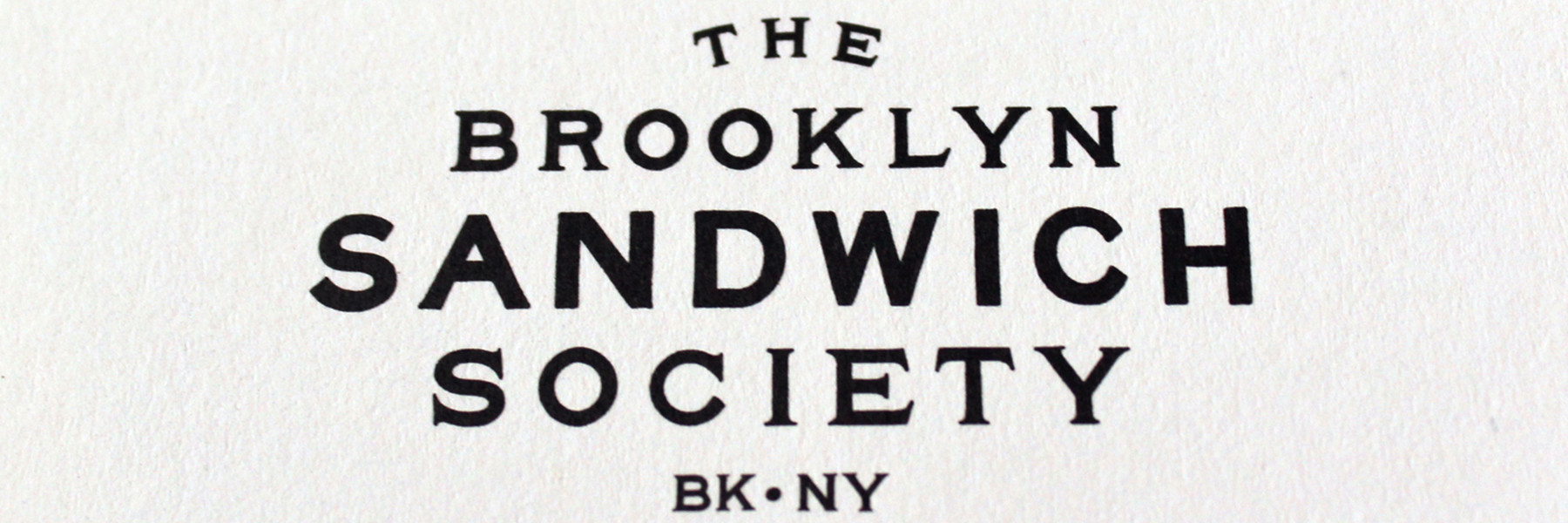
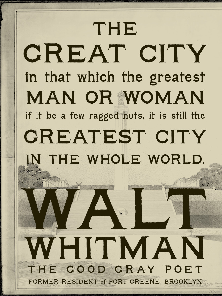
When Melissa Gorman was dreaming up The Brooklyn Sandwich Society, she envisioned bringing back the best parts of yesterday. Everything from the atmosphere, to the food, to the visuals and identity. Moving forward with all the collateral, she asked me to breathe life into an old type specimen she would use to give their new restaurant the right voice.
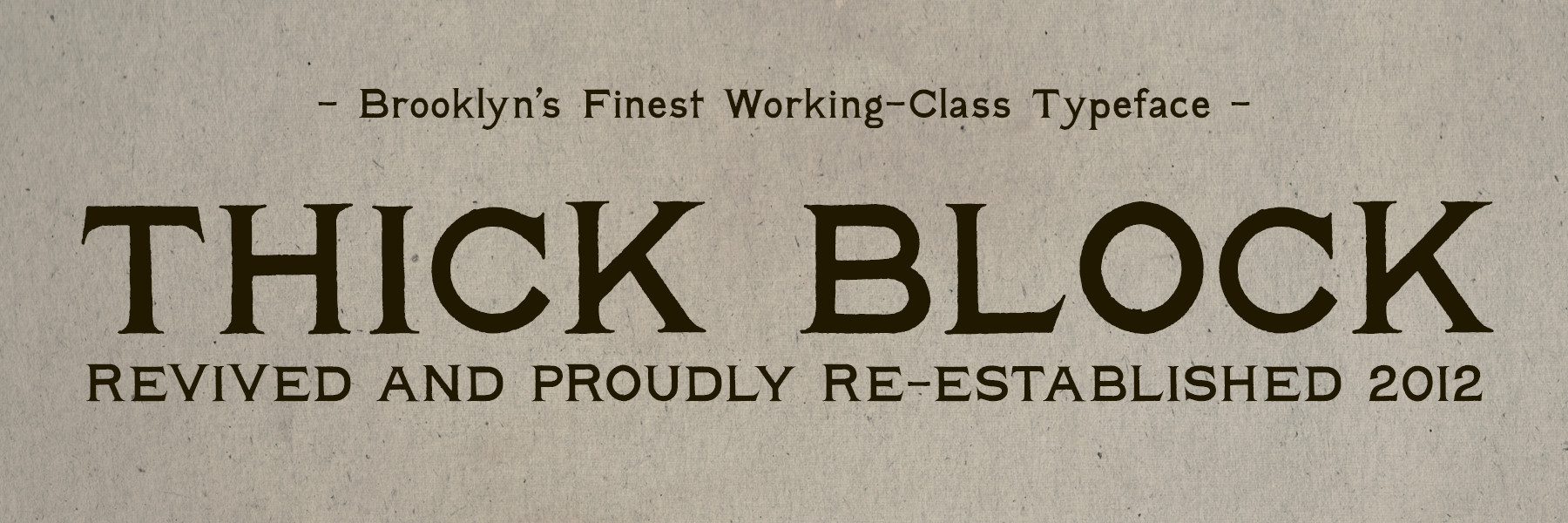
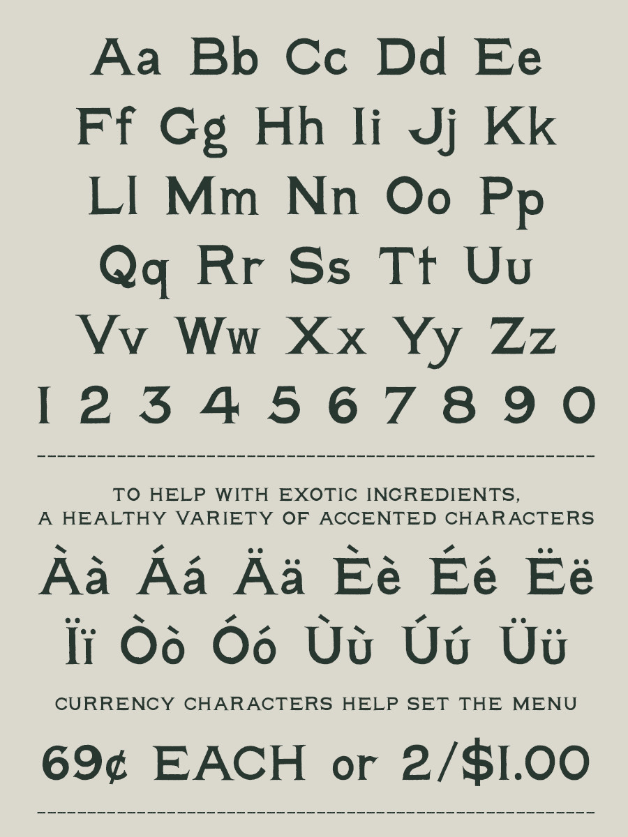
After evening out the weights between the upper and lower cases, adding some missing characters, and spacing everything just right, the dust had been blown off and revealed Thick Block.

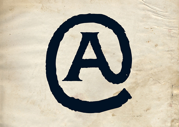
An Unconventional Symbol.
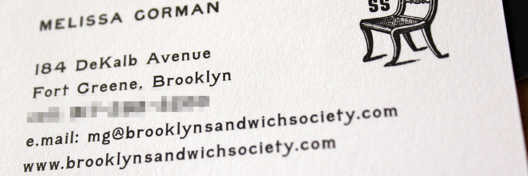
The “@” symbol wasn’t around when Thick Block was born so many years ago. The revival features an unorthodox, but fitting interpretation. The Brooklyn Sandwich Society welcomed the oddity with open arms.

Thick Block in Print for The Brooklyn Sandwich Society.
Thick Block was originally commissioned for a small restaurant in Brooklyn, NY. The typeface was used with supporting collateral up until the day it closed in 2013.